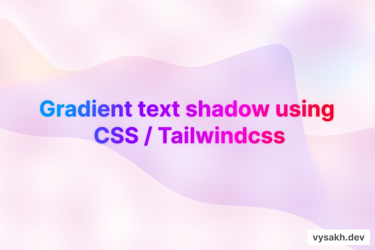
How to make gradient text shadow using CSS / tailwindcss
One of the most captivating aspects of modern web design is the ability to create stunning visual effects. Among them, gradient text shadows can add a touch of sophistication and dynamism to your webpage. This article will guide you through the process of creating gradient text shadows using CSS and Tailwind CSS. We'll take a simple example of a block of text and add a gradient shadow to it, using the following code snippet:
<div className="relative text-5xl md:text-6xl ">
    <h2 className="  leading-tight text-main-grd z-10">
        Building Things
        <br />
        <span className="font-extrabold"> That Inspire </span>
    </h2>
    <h2 className=" leading-tight text-main-grd absolute top-0 text-bg-blur ">
        Building Things
        <br />
        <span className="font-extrabold"> That Inspire </span>
    </h2>
</div>
The Basic Structure
The code snippet above is a JSX expression (which is typically used in React) that contains two heading components: one for the main text and the other for the shadow. The div container has a relative class, which allows the child components to be positioned relative to it.
The main text and the shadow text have the same content, "Building Things That Inspire". The primary difference between the two lies in their CSS classes.
Creating The Gradient Text
The first h2 tag represents the main text. The text-main-grd class is a custom class that we have defined to implement gradient text. To achieve the gradient effect, you would typically define this class in your CSS file like so:
.text-main-grd {
    background: linear-gradient(to right, #ff5f6d, #ffc371);
    -webkit-background-clip: text;
    -webkit-text-fill-color: transparent;
}
Adding The Text Shadow
The second h2 tag is used to create the shadow effect. The text-main-grd class is reused to apply the same gradient effect. The absolute class places the shadow text directly over the main text. To create the blurred shadow effect, we use the custom text-bg-blur class
.text-bg-blur {
    filter: blur(5px);
    z-index: -1;
}
The filter: blur(5px); blurs the text, creating a shadow-like effect. The z-index: -1; places the blurred text behind the main text, which is on z-index: 10.
Leveraging Tailwind CSS
If you're using Tailwind CSS, you can achieve the same effect with utility classes. Here's how you could translate the above example
<div className="relative text-5xl md:text-6xl ">
    <h2 className="leading-tight bg-clip-text text-transparent bg-gradient-to-r from-pink-500 to-yellow-500 z-10">
        Building Things
        <br />
        <span className="font-extrabold"> That Inspire </span>
    </h2>
    <h2 className="leading-tight bg-clip-text text-transparent bg-gradient-to-r from-pink-500 to-yellow-500 absolute top-0 blur-md z-negative-1">
        Building Things
        <br />
        <span className="font-extrabold"> That Inspire </span>
    </h2>
</div>
Creating gradient text shadows can add a unique and dynamic visual effect to your webpages. By leveraging CSS and Tailwind CSS's utility classes, you can achieve this effect with ease and flexibility. Happy coding!